 0118 948 1610
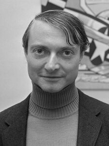
All art can be seen as a progression and development of visual expression. Rarely is there an artist that stands apart from this projection through time. Roy Lichtenstein, an American artist (1923-1997), is no different. Known for his comic book Pop Art styling he was a heavy weight of his day and an equal to the likes of Andy Warhol. On the face of it his art is loud, vibrant, and easily consumable. His works, like the comics they represent, lack the intellectual depth of other artists of the time. In fact the appearance of this shortfall is what gives the movement ‘Pop Art’ its name, mass appeal and continuing popularity through to modern graffiti artists such as Banksy, Obey, and Mr Brainwash. The simplicity of experience combined with my own love of super hero comics made Roy Lichtenstein’s work an immediate point of inspiration in my own work as a teenager.
However, the delight of Pop Art is that the glossy veneer actually hides depths of meaning and intellectual thought. This was true of Warhol and was also certainly true of Lichtenstein.
A core aspect of Lichtenstein’s work is the way in which the optics work between the eye, the brain, and the artwork.
Stepping back into the late nineteenth century artists and printers were concerned with capturing colour in a purer way to increase the vibrancy of their pictures and enhance the visual experience. Pointillism was a philosophy whereby painters applied pure unmixed pigments (usually primary colours but some included green and black) to the canvas in little dots. These dots would reflect the right waves of light into the eye so that they ‘mix’ when the brain tries to interpret what has been seen. This technique produced many great works of art by the likes of George Seurat and Paul Signac (some of their best works hang in the National Gallery).
Working at the same time as the Pointillists was an Illustrator and Printer Benjamin Henry Day Jr. He worked out that the same dots that the Pointillists were exploring for fine paintings could improve the speed, efficiency, and variety of colours that could be produced in printing. Printing using this method, with lines or spots, meant that fewer colours had to be premixed before printing could begin. This method of printing was adopted by anyone wanting to produce fast, cheap, colourful pictures and was the obvious step for comic books in the 1950s.
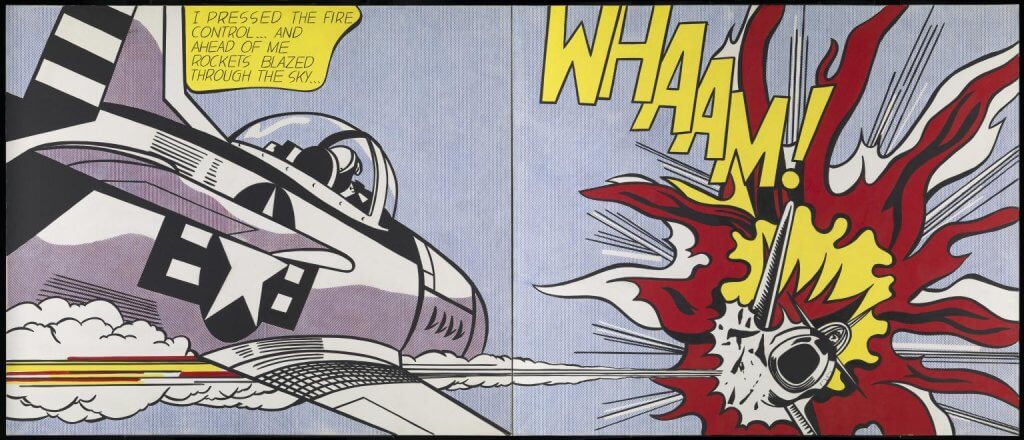
Lichtenstein takes on this principle idea and continues to explore and develop the idea throughout his career. He experiments with different sizes, larger and smaller gaps between dots, and mixes of colour. His continued and persistent study of this principle through his work gives his pieces the depth of meaning key to true Pop Art and connects him with past visual traditions.
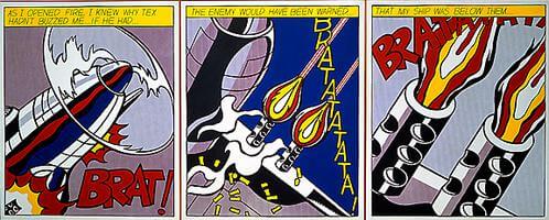
As I open Fire, first painted in 1964, is a perfect example of Lichtenstein exploring the Ben Day Process. The background in the left most picture, in particular, is a beautiful mix of regimented, coloured dots, that blend in the eye to create a highly texture and intricate lilac colour.
This work will be on show in The Caversham Picture Framer throughout June 2021 and is a perfect opportunity to see how Lichtenstein used the Ben Day Process to his advantage.
Useful Links
https://en.wikipedia.org/wiki/Roy_Lichtenstein
https://en.wikipedia.org/wiki/Ben_Day_process
https://en.wikipedia.org/wiki/Benjamin_Henry_Day_Jr.
https://en.wikipedia.org/wiki/Pointillism
https://www.nationalgallery.org.uk/paintings/georges-seurat-bathers-at-asnieres